An attempt at stylizing Ryka: The “Curvy Ryka” script
While I really love the general structure of my Ryka script and how it works, the characters look unpolished and still quite “proto-like”. There is no common aesthetic to most of the consonant glyphs, and many still closely resemble the pictograms they are based on. When writing a sentence, the result often looks a little messy, and some combinations of characters and diacritics are really hard to write due to the diverse shapes. Most natural scripts have evolved into a characteristic common style over time, so that you can often guess for a single character which script it belongs to, because it just looks similar to other characters of that script. I mean, just look at Georgian, Bengali, Kannada, or Thai – such unique styles! I would really like to develop a similar coherent aesthetic for Ryka.
I recently browsed Carsten Becker’s website and read this post about creating a blackletter version of his Tahano Hikamu script. This inspired me to finally sit down and try to develop a stylized version of Ryka – reshaping the characters into a common style.
Transforming the base characters
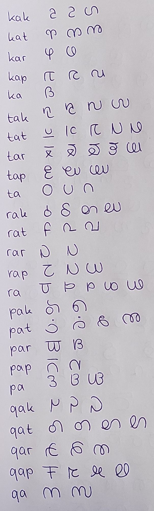
I had no particular style in mind, so I just picked a random base character that I liked (pak) and started altering its shape by drawing it quickly and without lifting the pen. I also used this method on some combinations of pak and a vowel or mode diacritic. I ended up with two new versions, one of which looked a bit like an @ symbol, and one which resembled a owercase g. Not entirely satisfied, I tried experimenting with another character, qar. This time, I ended up with a character that looked like a Malayalam ta (ത). I went back to pak and produced a third version which resembled the Malayalam vowel diacritic e ( െ).
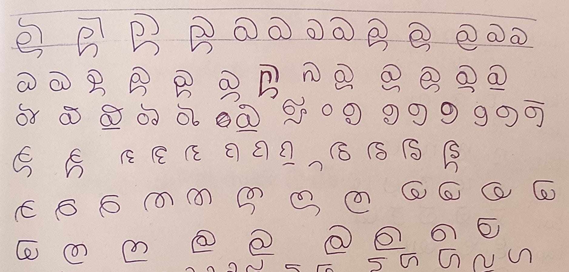
I decided to go with the Malayalam aesthetic and now started from the beginning of the Ryka consonant chart. After some hours of doodling around, I had turned all 25 base characters into wide, curvy characters. I added some extra curves, curls or lines where two characters looked too much alike or where the vowel diacritics wouldn’t fit properly (more on that later). This is the result, with some intermediate changes, so you can see how the shape was transformed:
Many of these characters now bear an uncanny resemblance to some Malayalam characters, some are even identical. While I did aim for a Malayalam-y look, I did not intentionally reproduce actual Malayalam characters (you can see the evolution above), so it’s really interesting to see the parallels:
- kak → ഗ ga
- kat → ൻ n
- kar → ര ra
- ka → ദ da
- tar → ഝ jha
- ta → റ ṟa
- rat → വ va
- rar → ധ dha
- pak → െ e (diacritic)
- pat → ൽ l
- qat → ശ śa
- qar → ത ta
- qa → സ sa
Creating matching diacritics
After having transformed the base glyphs, I set out to adapt the vowel and mode diacritics. In Ryka, much of the “messiness” is caused by the fact that the base-vowel ligatures are all very individual. While the general shape of the vowel/mode diacritics is always the same (e.g. a small circle for e or a straight line for u), the exact place where it attaches (small circle on the top, bottom, middle) as well as its orientation (straight vertical, horizontal, diagonal line) is unique for each base character, and the diacritics can even alter the shape of the base character (especially true for the mode tails).
For the Balconian script, a sibling of the Ryka script, I resolved this by having detached diacritics that are simply placed on top or bottom of the base glyph. However, since this new script is a descendant, not a sibling of the Ryka script, it makes sense for it to share the “connectedness” of the Ryka base characters and diacritics, albeit in a simplified form.
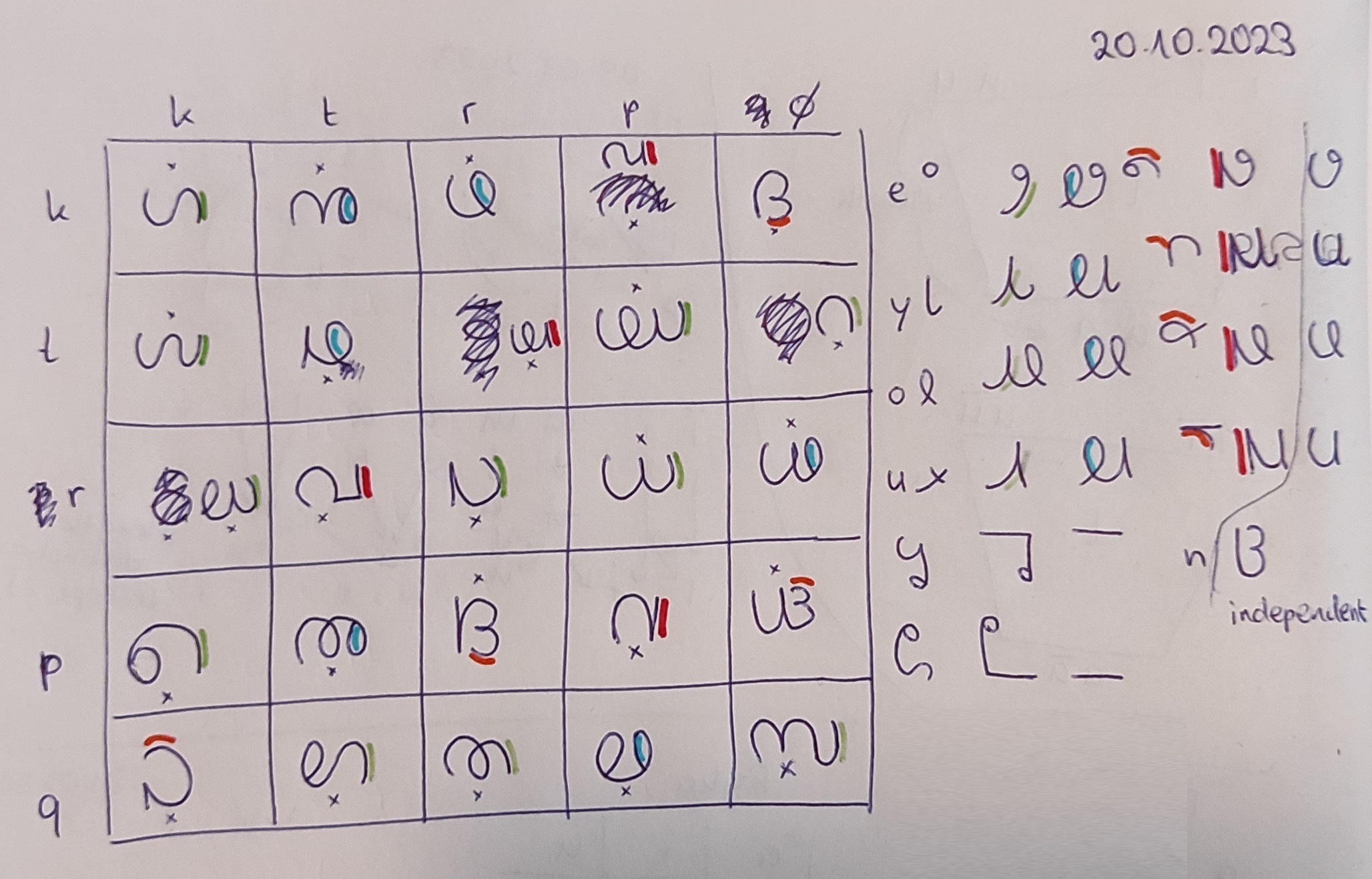
To achieve this, I first decided to test the base characters for any common “end” shapes. I initially found three groups:
- Those ending in a wide upwards or downwards curve, like kak or pak.
- Those ending in a closed loop, like kat or ra.
- Those ending in a narrow horizontal curve, like ka or pa.
There were a few characters that didn’t fit into the above groups, namely kap, tar, rak, rat, and pap. I modified these five characters further, until rak fit into group 1 and the other four could form a fourth group: 4. Those ending in a straight vertical line.
I then created versions of the four vowel diacritics for each of the four shape groups. For groups 1, 2 and 4, these look extremely similar (2 and 4 are basically the same), since the base characters of these groups all end at the top or bottom right side and in a more or less vertical line or curve. Only group 3 stands out, since it ends in a horizontal curve.
As for the mode tails, I already played around with them while creating the base glyphs, so my base glyphs all start at the bottom or top left side already. The mode tail in this script is just a straight horizontal line that’s drawn from right to left and then continues as the base glyph, just as in the Ryka script. What’s also the same is that glyphs will be flipped for one mode, so e.g. a glyph that starts on the bottom can directly use the water mode tail, and must be flipped when in wind mode, so that the mode tail can attach on the top. Likewise, the vowel diacritics will be flipped in each group, e.g. depending on whether a group 1 character ends in a downward or upward curve.
The independent mode characters (for word-final mode) are just disconnected straight lines on top or bottom of the glyph. The indendent vowel characters are basically the detached group 4 diacritics.
The new script in action
Time to put our new script to use and write something! To create a sample of the new script, I picked the first sentence of my current Ryka translation of the “Tower of Babel” story:
Pjohur rykajd qakohur lath dal katthanb ko turragakshy.
One language and one TONGUE existed in the whole world.
I first wrote it down in the Ryka and Balconian scripts for comparison and then in the new “Curvy Ryka” script. Here’s what it looks like:
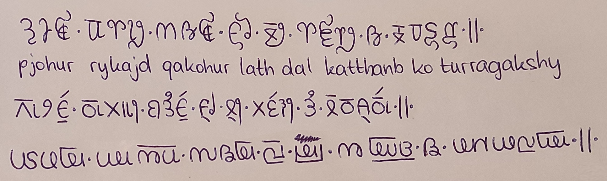
The result I think looks pretty awesome: All letters have a similar style, with many recurring shapes, and the limited number of base character endings make the diacritics look less awkward. It looks cleaner and more coherent than both Ryka and Balconian. On the downside, the number of different shapes in the script is really small and many characters look almost the same, especially when taking the flipping into account. Ryka and Balconian are certainly easier to read since their characters are much easier to distinguish. I am also not one hundred percent sure whether any of the base character + vowel combinations might not end up being identical to one of the larger base glyphs. One would have to use the script a bit more to find out whether it’s actually practical.
Conclusion
Curvy Ryka was a fun experiment and regarding how little time I spent on it, I really like the result! I managed to produce the uniform, clean look I was aiming for by trying to reuse shapes and making sure that there was a limited number of starting and ending positions for the glyphs to keep the number of variations of mode and vowel diacritics small. However, the result might actually look a little bit too uniform, since the base characters are often extremely similar to one another. Also, even though I like the Malayalam-y look, Curvy Ryka has too much of the Malayalam script for me to actually use it for my world.
Still, the experiment taught me a lot on how to achieve a cleaner look for my script, which will definitely come in handy for the next attempt. 🙂