New script, new luck – designing a Balconian font
After a longer break from active conlanging caused by my transition from university to working life, the first project I would like to tackle is yet another font – this time for a script with the working title “Balconian”. I originally created this script in 2017 for the Balconian Ric language (also a working title), a close relative to Ryka. Balconian Ric was supposed to be spoken on a group of water-based islands whose inhabitants continued to speak Ryka after the mainland Asiuluiam switched to Asiul. Thus, Balconian Ric underwent a number of sound changes distancing it further from the common ancestor Old Ryka. The writing system was also simplified, with the consonant glyphs becoming more geometric and the complex ligatures they formed with the vowels and mode tails resolved into simple combinations of diacritics.
The Balconian language itself so far only consists of a few ideas for interesting sound changes, but the script is already complete except for numerals. I actually like its look so much that I am now considering to take it back to the mainland – perhaps make it the script primarily used in the western (or non-sun-faced) parts of the Asiulvesacam, where they might also have continued using Ryka during the Asiul period. Either way, I will definitely keep it for one of the Rykaic languages, so designing a font for it is worthwhile and a good starting point to get back into conlanging, since I don’t actually have to invent something new. It also won’t be as much of a pain as designing the Ryka font due to the lack of ligatures. 🙂
The Balconian glyphs
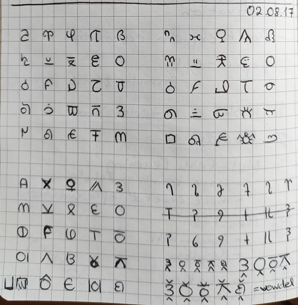
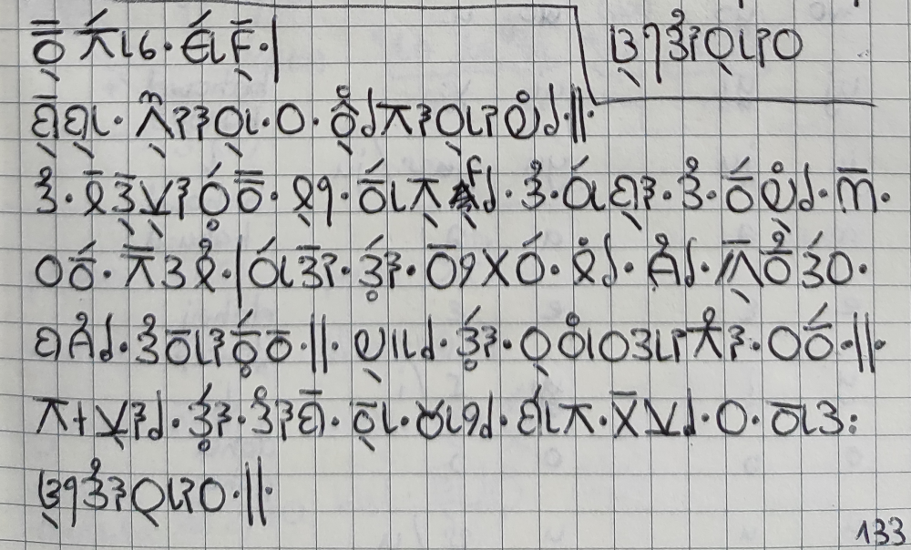
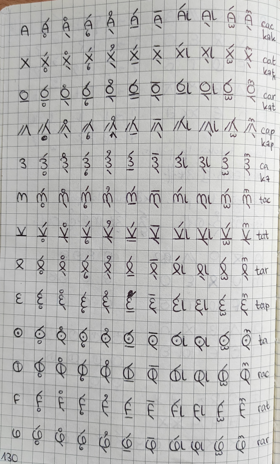
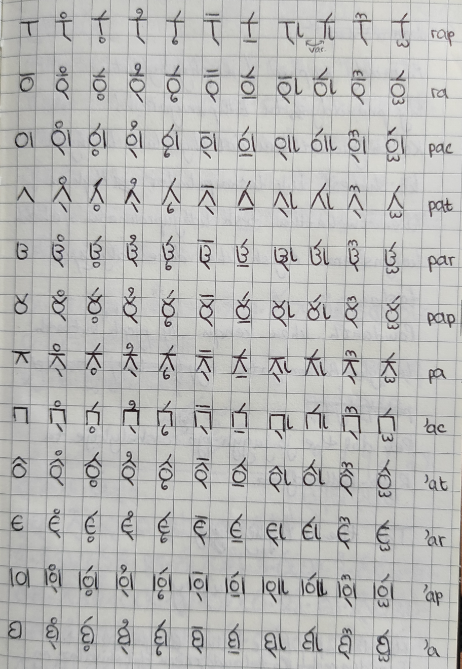
The script has the same basic glyph inventory as Ryka: It consists of the 25 CV(C) syllable glyphs common to all Rykaic languages as well as 6 independent vowel glyphs (/a/, /e/, /o/, /u/, /i/, /n/), 5 vowel diacritics (the inherent vowel /a/ is marked by the absence of a diacritic), 2 independent mode glyphs (water and wind), and 2 corresponding mode diacritics. The only addition is a diacritic that deletes the inherent vowel from a CV syllable to express a single C. This was necessary for Balconian Ric because some of the sound changes I envisioned encompassed vowel deletion and the creation of consonant clusters that could not have been displayed otherwise. I also intended the language to follow a historic orthography; the language’s name “ric”, for instance, would not have been written using the CVC glyph “RVK”, but rather as RiKV, so using the CV glyphs RV and KV, but applying the vowel deletion diacritic on the latter. This of course reflects that “ric” is derived from the Ancient Ryka word “ryka” which would also have been written with two CV glyphs.
Unlike in Ryka, where the syllable glyphs may turn upside down to attach to a water or wind mode tail, Balconian syllable glyphs can always keep their vertical orientation, since the Balconian mode diacritics are not attached to the syllable glyph. The vowel diacritics are separate as well. They go on top of the glyph by default, unless there is a wind mode diacritic taking this place. In that case, they are placed below instead. The only exception to this is the vowel /i/, which is always placed to the right of the syllable glyph.
The only glyphs I forgot to create when working on the script in 2017 are the numerals, so part of this project is also to add these. Like Ryka, Balconian Ric uses a base-8 numeral system, so I will need eight simple glyphs for the basic numbers 0 to 7.
Plans for the font
While I used a combination of FontArk and FontForge when creating the Ryka font, I would now like to work in FontForge only. The grid system of FontArk, while definitely helpful to get a first grip on designing fonts, felt a little limiting in the end. Also I feel like it made my font too clean and symmetric. The Ryka font also has no variations in line width which contributes to this. Of course, one of the reasons for this simple style was also to make putting together the 400 ligatures a little easier. This is no issue with Balconian. So my goal for Balconian is to create a font that is not only functional but also looks pretty.
I will also try to use a Unicode range in the Private Use Area that is not already occupied by another conlang. I have consulted the Under-ConScript Unicode Registry and decided to go with code points ED80−EDFF which has 128 free spots that should be more than sufficient for the Balconian glyphs.