Designing a font for Ryka, an abugida script with heavy use of ligatures
When I had fleshed out the writing system of my Ryka language, like probably any other conlanger out there, I wanted to create a font for it so that I could actually type texts in my language’s script. While designing the glyphs themselves was an artistic challenge on its own (and the result is far from perfect), the real hassle began when I was trying to install and use my font. So here’s the story of how I managed to get a more or less usable font and matching keyboard layout for my language.
Requirements for a Ryka font
First off: If your language has a simple alphabet or syllabary with glyphs (characters) that stand on their own, do not interact with each other and do not have contextual alternatives, you are fine. Design your font, compile it, install it and enjoy. If, on the other hand, you recognize yourself and your language among the following requirements that I had for Ryka, you have a problem.
Ryka’s script is an abugida, i.e. a syllabary where any vowel apart from the so called “inherent vowel” is marked with a diacritic. Diacritics can be problematic on their own (read on), but Ryka’s diacritics are not simply placed on top, below or next to the main character; they attach to it and may change its appearance. To make things worse, there is one additional type of diacritic, the so called “mode tail”, that attaches to the main character and will often rotate to whole glyph or alter it in other ways. Finally, in the vicinity of a matching final (normally independent) tail glyph, the shape of the tail itself changes which results in yet a different looking syllable glyph (for details on this simple, but complicated-sounding system, read this). To sum it up: Ryka has 25 base characters, 6 vowel characters, 4 vowel diacritics, 3 tail characters and 2 tail diacritics which can be combined into well over 400 complex characters, all of which are easily decomposable to the human eye, but all require their own glyph.
Of course, I didn’t want to use a code point for each of these 400+ complex glyphs, because they are obviously combinations of diacritics and base glyphs. The Korean Hangeul script, for example, has individual code points for each of its over 11,000 syllable glyphs (at least on Windows), even though they are transparently composed of only 19 consonant and 21 vowel characters. This is very inelegant. I once had the task to write an orthography-to-IPA converter for Korean and ended up having to initially convert each of the 11,172 characters separately into their respective transliteration. This monster is not something I wanted to create for Ryka. Instead, I wanted 25 code points for the base characters, 6 for the vowel characters, … you get it. When typed after each other, they were supposed to be displayed as the single complex character they represented, just as in the Indic scripts. If, in Malayalam (also an abugida), you type “മ” /ma/, then the vowel diacritic “ൊ” /o/, you get “മൊ” /mo/. Since there are fonts for languages like Malayalam that achieve just that, it shouldn’t be too difficult to create something similar for Ryka… right?
Finally, all the characters of natural languages’ scripts have their own code point ranges in Unicode. It was clear to me that I would not reuse some other poor language’s code points, but that Ryka would get its own block in the Private Use Area, that, as far as I had understood from my university classes, was fit for just that purpose. I settled on using the first batch of Private Use code points, starting from U+E000. Looking back, I maybe should have picked something a little further back, since I have by now learned that I am not the first conlanger to throw an eye on the the PUA and Ryka’s Unicode range is actually already inofficially occupied by Tolkien’s Tengwar of all languages. Oh well…
Designing the glyphs
Creating fonts is a science of its own and I initially was very intimidated by all the unknown technical terms and complications surrounding the task. The go-to program for font design is probably the free FontForge which has all the complex font editing tools that you can dream of. When starting to design my Ryka font, I found it extremely overwhelming. Back then, it was also looking very old and clunky, but now that I had a look at their website again for this text, it seems that they have polished the UI quite a bit.
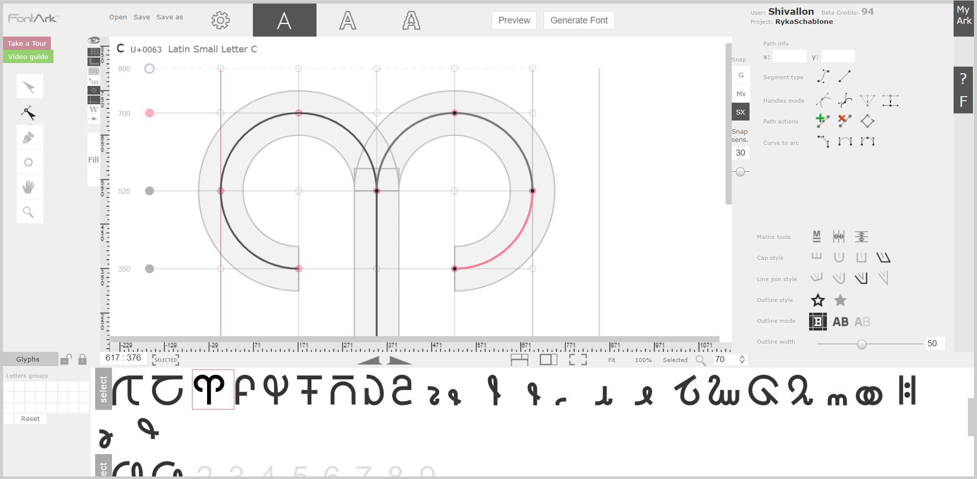
When looking for alternatives for FontForge, I came across FontArk (free while still in beta), a much simpler browser based font creator (note that it only works in Chrome, Opera and Vivaldi). I found its matrix system extremely helpful for a beginner like me. The glyphs are anchored to a customizable grid and it’s possible to just work on the skeleton, i.e. the lines of your glyphs, without having to care about their shape and width. Most importantly, repeating shapes at the same place in the grid in different glyphs can be edited simultaneously. I’m terrible at explaining what it does, just check out the video on their website. I found it extremely helpful for quickly creating hundreds of similar looking glyphs whose design ended up not being particularly elegantly shaped (though editing the shapes would also have been possible), but uniformly sized and symmetrical.
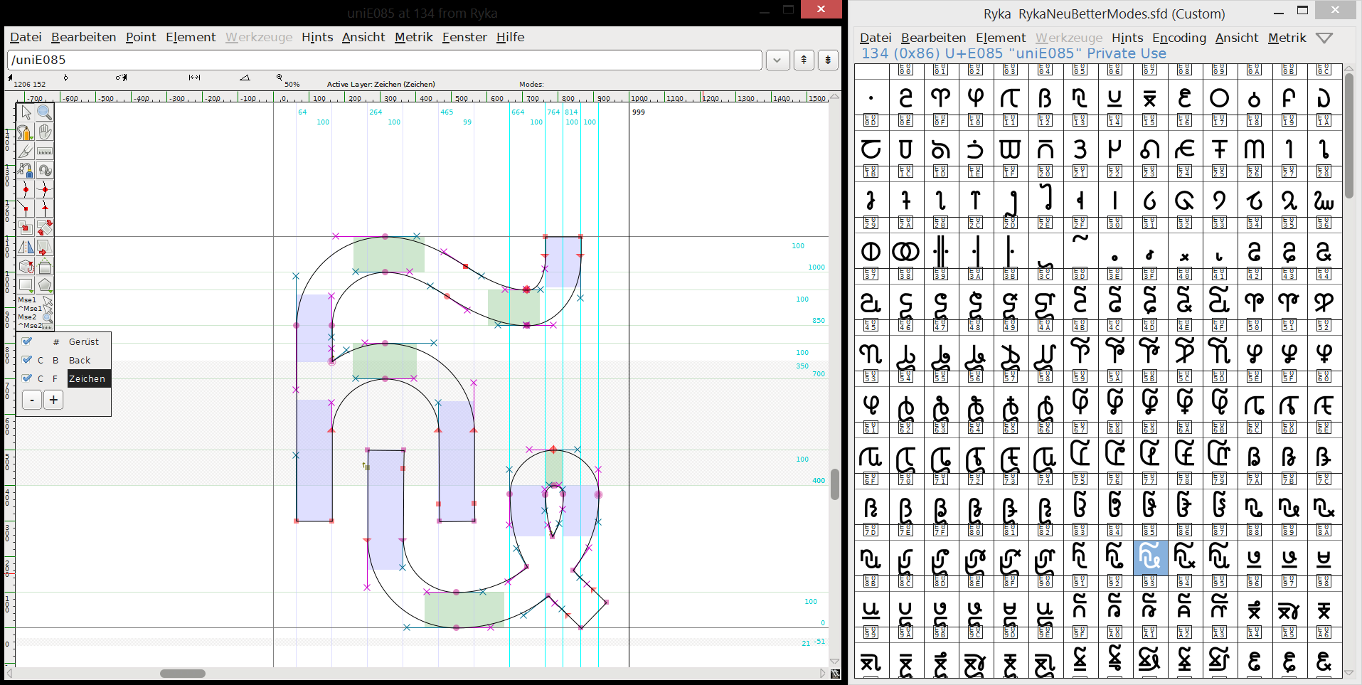
The font that I’m using now on this website is a second version I designed later, using both FontArk and FontForge (there was no way around it). I created the basic, repeating shapes (circles, lines, bows, the tails, …) in FontArk to get a uniform look to them and then pasted them together in FontForge. I’m so hesitant to use FontForge to actually design the glyph shapes because I’m afraid they will end up looking terribly unsymmetrical. FontArk has something geometric to it that I really like.
Attempting to get the ligatures to work
The result of my FontArk-FontForge design was this: An OpenType font with glyphs for the base characters and diacritics attached to the PUA code points I selected and with glyphs for all the combining characters that were not attached to any code point. They should be rendered contextually by the font, after all. I had done my homework and found out that ligatures (combining characters) were possible in OpenType fonts. I don’t remember the technical details (spoiler: It didn’t work), but there was some table that you could edit in FontForge which stored the information as to which characters combine as which complex characters. It was tedious to manually input all contexts for about 400 glyphs, but I was finally able to compile my Ryka font.
Unfortunately, my characters remained separated and no ligatures showed. I double-checked everything. I filled out other tables. I recompiled my font over and over. I googled for hours. Finally, after desperately entering some obscure search terms (maybe “opentype ligatures not showing private use area”), I ended up on this page where a user having the same problem as I concluded:
Word will preview fonts as I said without problems, but in order to convert the preview into a screen display or printed text it requires the font to be digitally signed. No digital signature = no display.
On a page linked later in that conversation, it turns out that OpenType features that are not conventional for their code points (so unlike e.g. the Indic ligatures), are only being rendered if the font has a digital signature attached, for which you have to buy a certficate. This especially concerns all fancy stuff in the Private Use Area, since it is, by definition, an area without conventions.
So OpenType was a dead end. I was desperate because I thought that this was the only possibility for displaying ligatures in fonts. I considered giving each complex character a code point and do the ligatures via dead keys on the keyboard layout (much like pressing ^ and then o on a German keyboard gives you the single character ô), but I believe there was some limit on the number of combinations allowed with dead keys (more on keyboard layouts below). Maybe it was just too tedious to do for all of my over 400 glyphs.
Actually getting the ligatures to work
When I was just about to give up, I came across SIL’s Graphite. On their website, they describe their font rendering system like this:
Graphite is a “smart font” system developed specifically to handle the complexities of lesser-known languages of the world.
Since my goal was to handle the complexities of an unknown language out of this world, I felt very addressed by this sentence. Spoiler: Graphite solved my problems, but it does not come without sacrifice.
The good news first: Graphite can render all the complex ligatures you can imagine. It builds upon an existing TrueType font (which can be created in e.g. FontForge) and requires a file in the (very easy) Graphite Description Language which, well, describes the glyphs’ complex behaviour, e.g. which characters form which ligatures together. If you compile your TrueType font with the GDL file, you end up with an innocent-looking TrueType font that can display all your fancy ligatures.
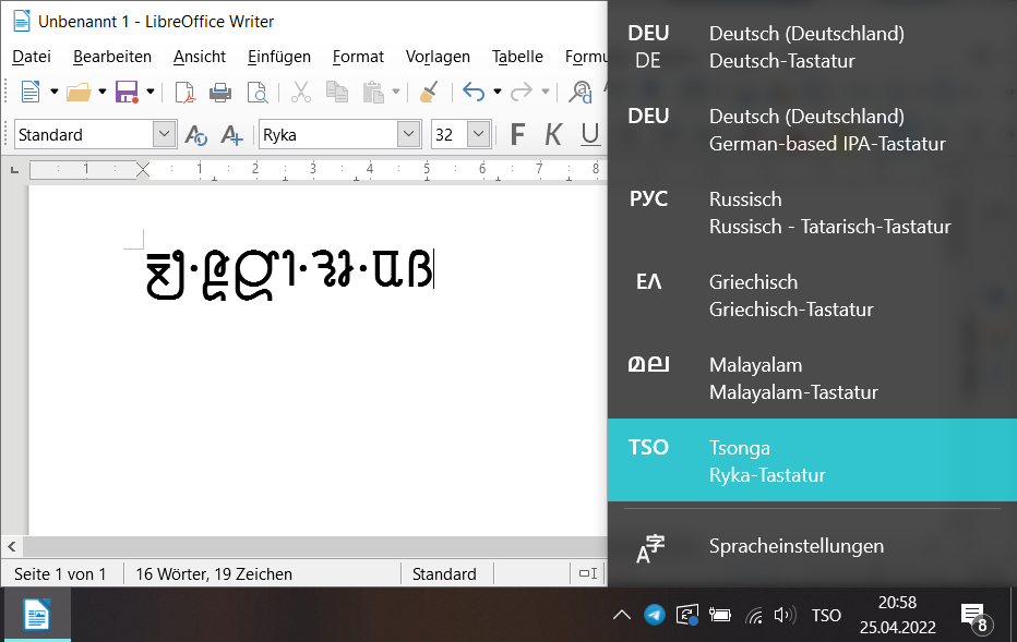
Unfortunately, Graphite is not widely supported. Graphite fonts can be rendered in, amongst others, Firefox, LibreOffice, OpenOffice and XeTeX. So it is supported by a browser, two simple text editors and a good text editor, which is at least sufficient for writing a grammar in LaTeX and setting up a website for people to view in Firefox. In all other applications, e.g. in Chrome, Edge or Microsoft Word, the features introduced by Graphite will not work and the raw base font will be displayed. This is also the reason why you will see a red warning box on top of some of my pages if you are using any browser other than Firefox.
Creating a custom keyboard layout
I personally use Windows because “never change a running system” (and I’ve been able to run anything I wanted on Windows so far). So I have no idea which fancy ways to create custom keyboard layouts exist in other operating systems. On Windows, as usual, the way is not fancy, but its manageable (and still working with Windows 10!).
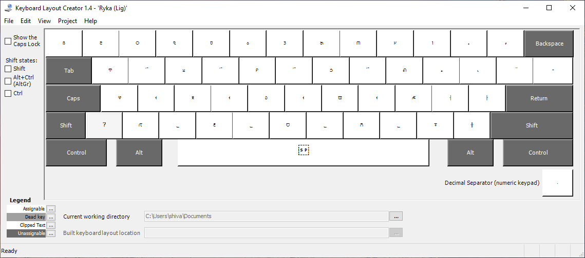
The Microsoft Keyboard Layout Creator is from 2007 and it looks and feels at least ten years older. Still, there is no other way to create real custom keyboard layouts (as in “installable on your system” and afterwards “selectable via Windows+Space”), so this is the thing. It is possible that if you open it, the window will be blank. Do not despair. (I almost did.) Go to your Windows settings and adjust the scaling to 100% (google how to do this if you don’t know). The program is so old and ugly that it is unable to deal with any other scaling.
There are a few other “oh Windows” moments that I would like to spare you. The MKLC creates an executable installer which installs your keyboard layout. Use it. You’ll have to reboot your system in order to actually see the result (maybe logging out and in is enough). This is the easy part. When you have done some changes to your keyboard layout, and try to install it again, it complains that this layout is already installed. You have to uninstall it first. This is a very sensitive process. All your custom keyboard layouts resides with your other installed programs under “Programs and Features” in your Control Panel. Uninstall it here. Then (very important!) reboot your computer, and, if you want to be on the safe side, throw some salt over your shoulder and reboot once more. Only then install your modified layout. If you fail to reboot properly (and who knows how to do this!), the old layout will vanish from your “Programs and Features” but Windows will still complain about the layout already being installed. You will then have to delete the remains of your old layout manually from the registry. If you were careless enough, here‘s how to do it. Don’t forget to reboot afterwards. Rebooting is the key to success when working with the MKLC.
End of the journey
So that’s how I got my Ryka font and keyboard layout to work. I had a couple of other adventures along the way, like when the MKLC decided that my QWERTZ keyboard was actually a QWERTY and couldn’t be convinced otherwise. All the keys I had lovingly assigned a spot in the MKLC were all over the place in the installed result. It took me a day at least to figure out what had gone wrong and I ended up having to remap the key codes manually in MKLC. Or when my 400+ glyph font project in FontArk got corrupted and couldn’t be loaded anymore (luckily, their support was able to fix the files)… But I doubt the technical details are of particular interest to any of you. 😉
(Edited on 2022-04-25 to add screenshots)